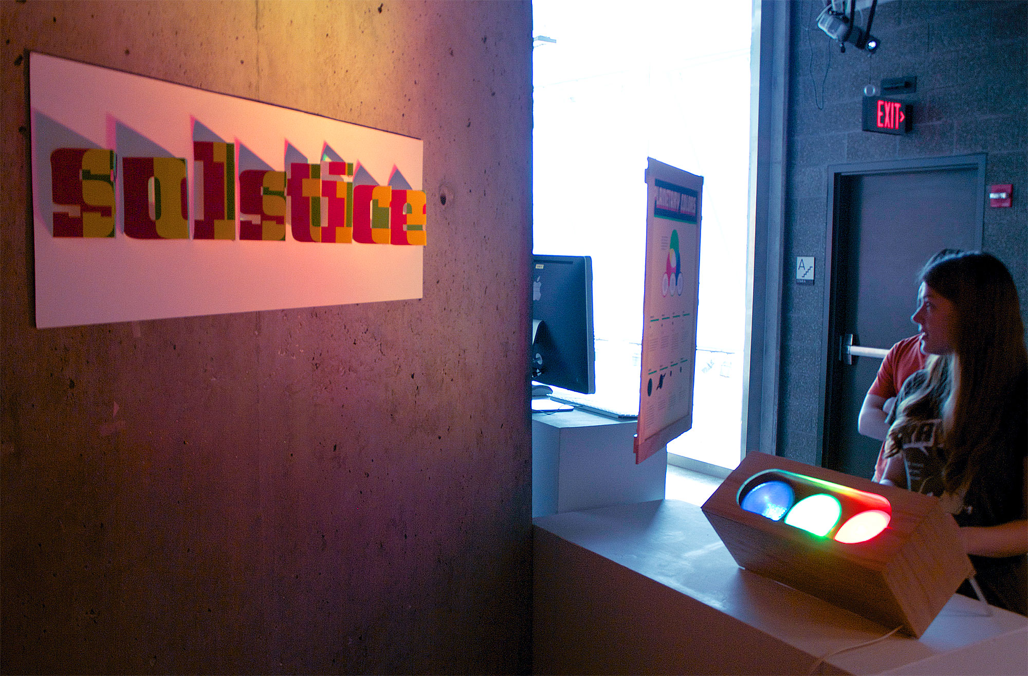
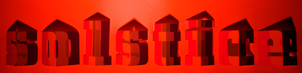
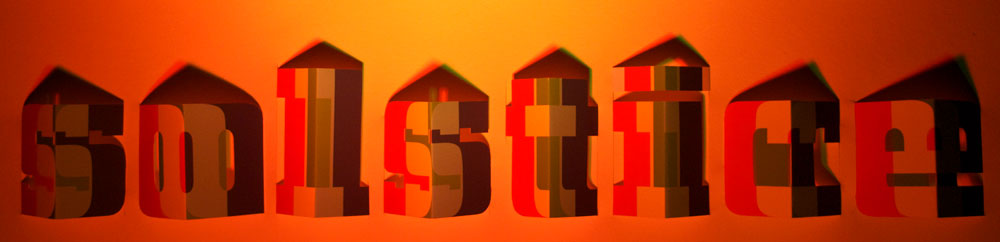
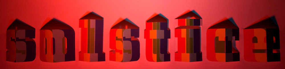
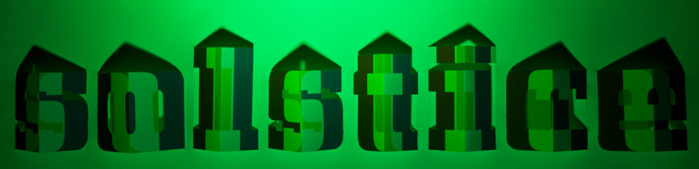
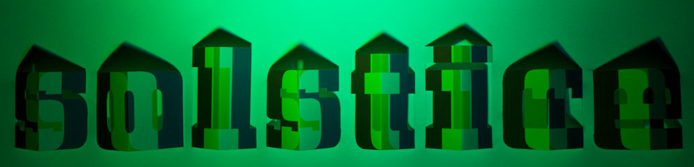
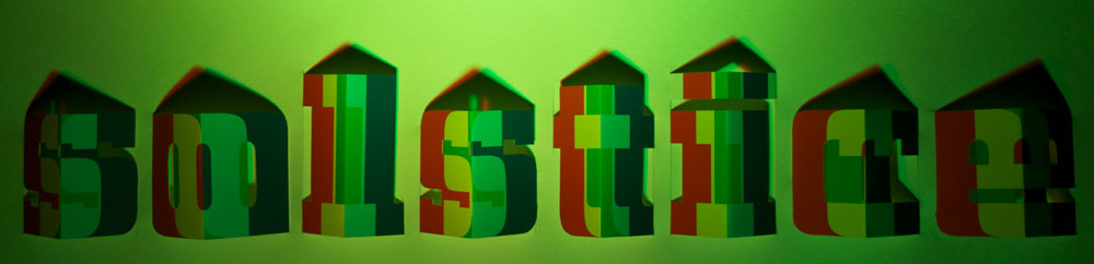
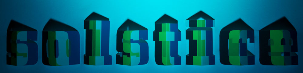
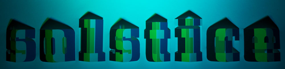
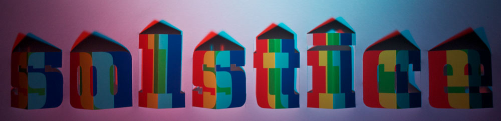
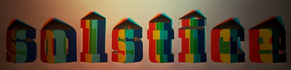
Solstice Exhibition
The term “solstice” is defined as “either of the two points on the celestial sphere where the ecliptic (the apparent path of the Sun) reaches its greatest distance north or south of the celestial equator.”
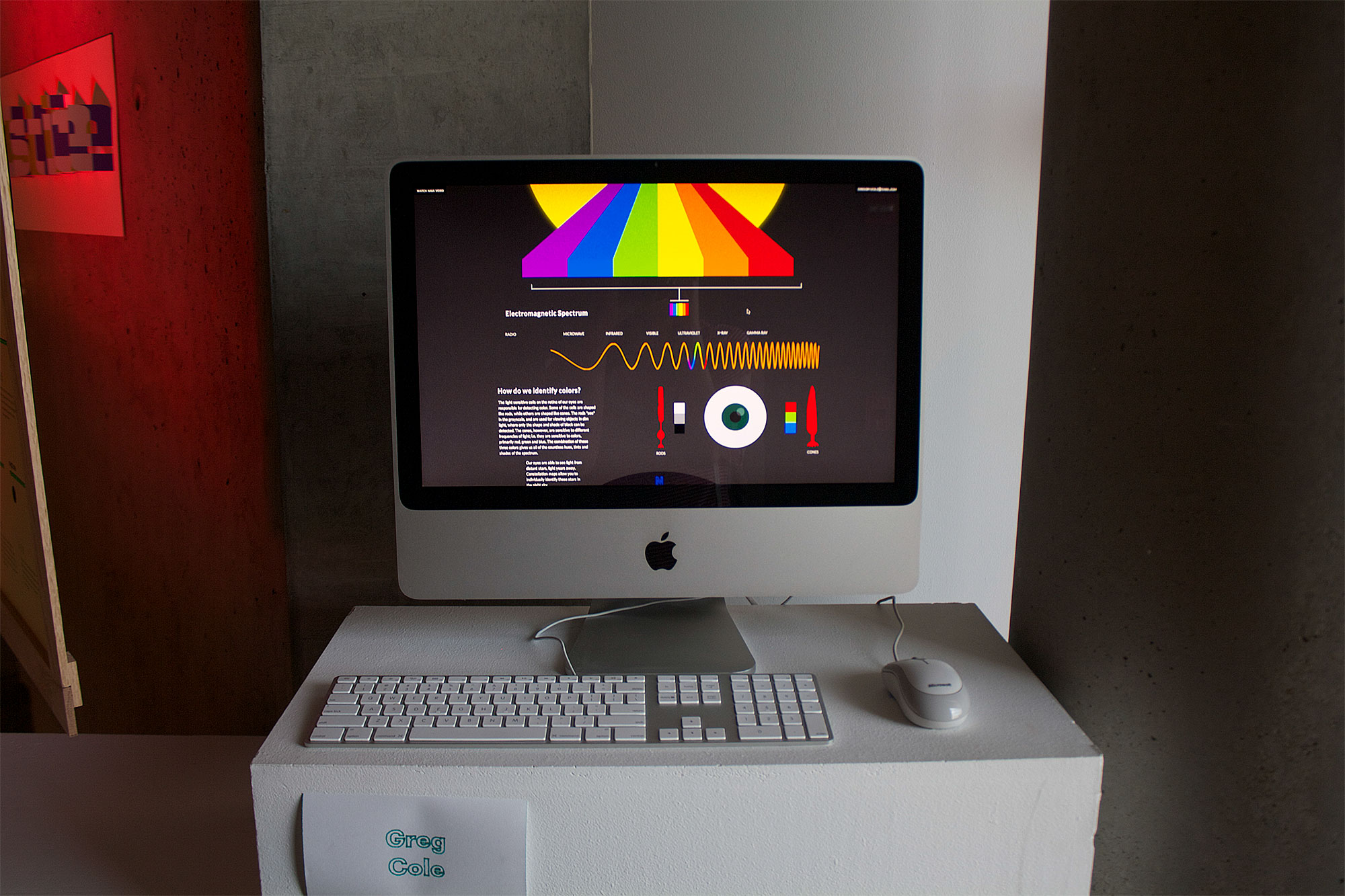
Visible radiation (light) is the small part of the electromagnetic spectrum to which the human eye is most sensitive. This exhibition uses the interaction of light and design as a visualization tool to illustrate and explain the occurrence of the visual spectrum in astronomy.
The viewer is invited to actively engage with the work:
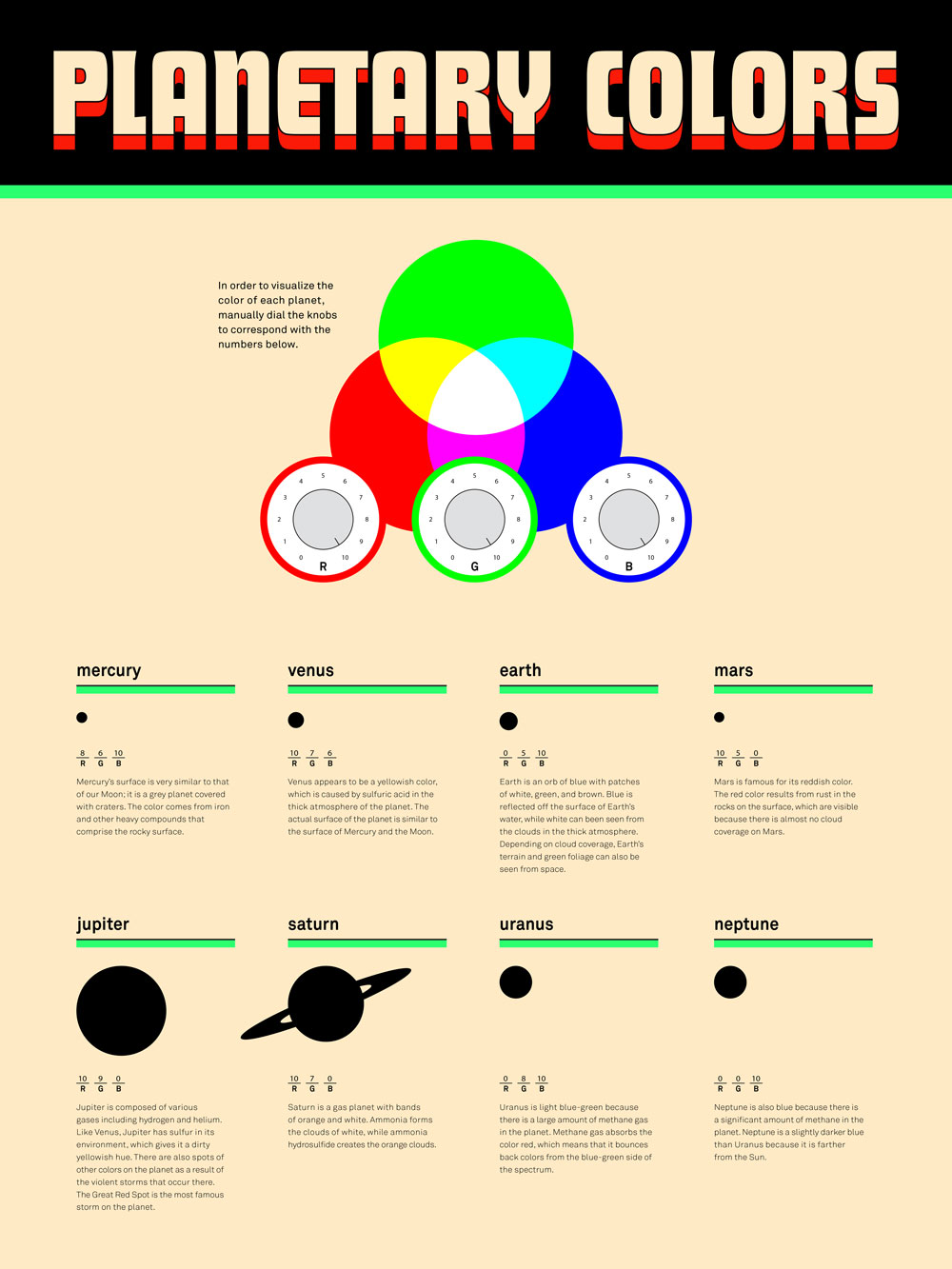
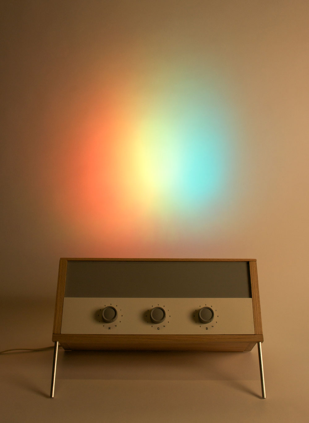
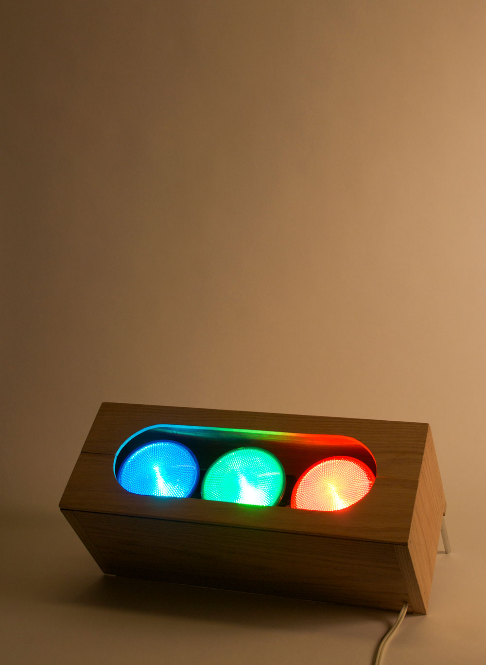
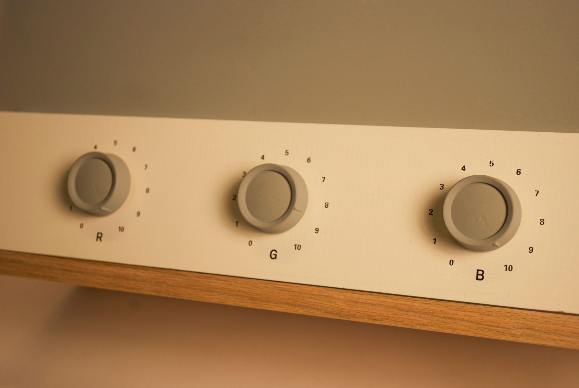
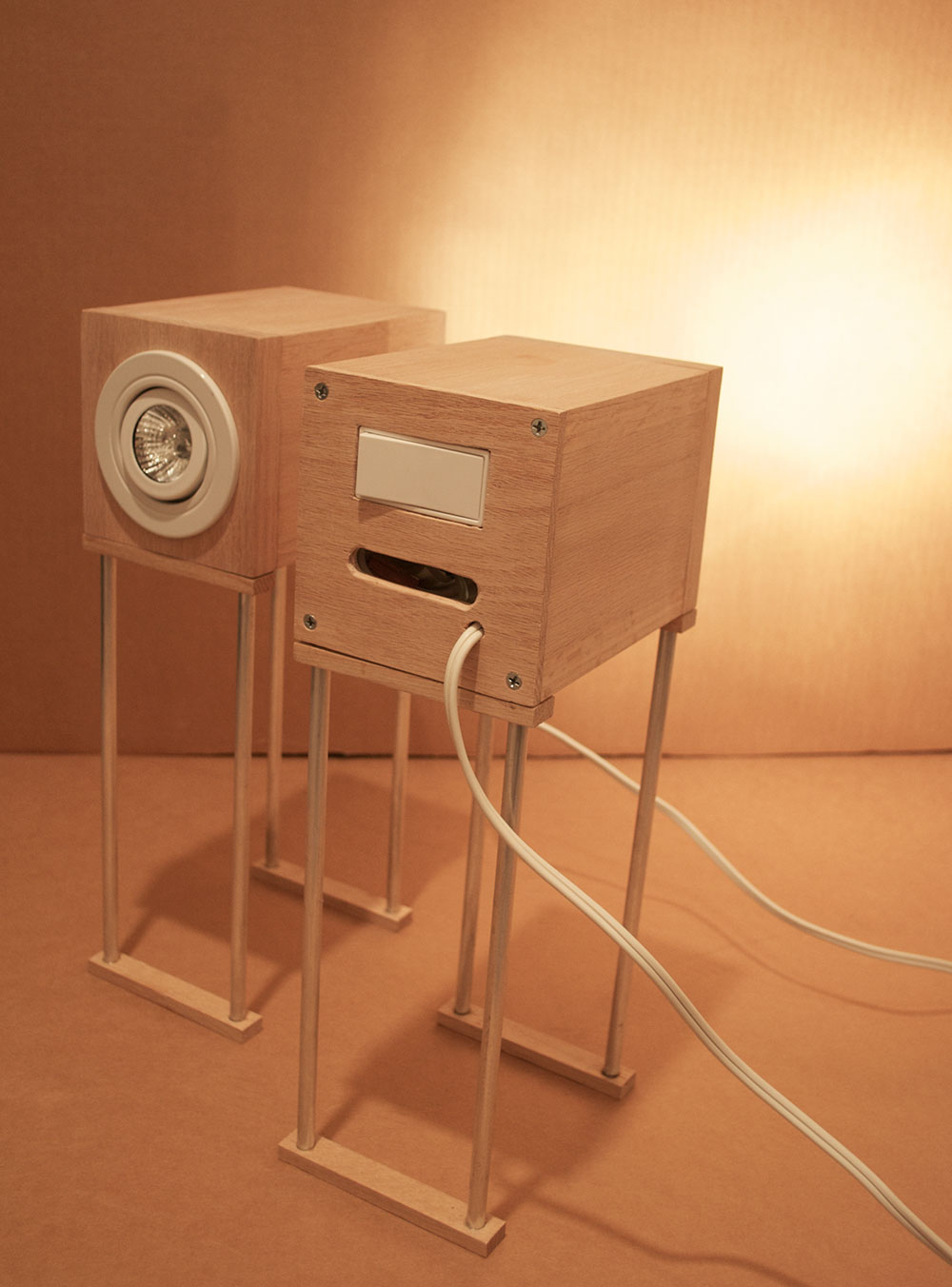
- The color-mixing lamp allows the participant to grasp a better understanding of the visible spectrum by manually creating colored light. By dialing in the RGB magnitudes provided by the complementary poster, the participant can visualize the colors of planetary atmospheres.
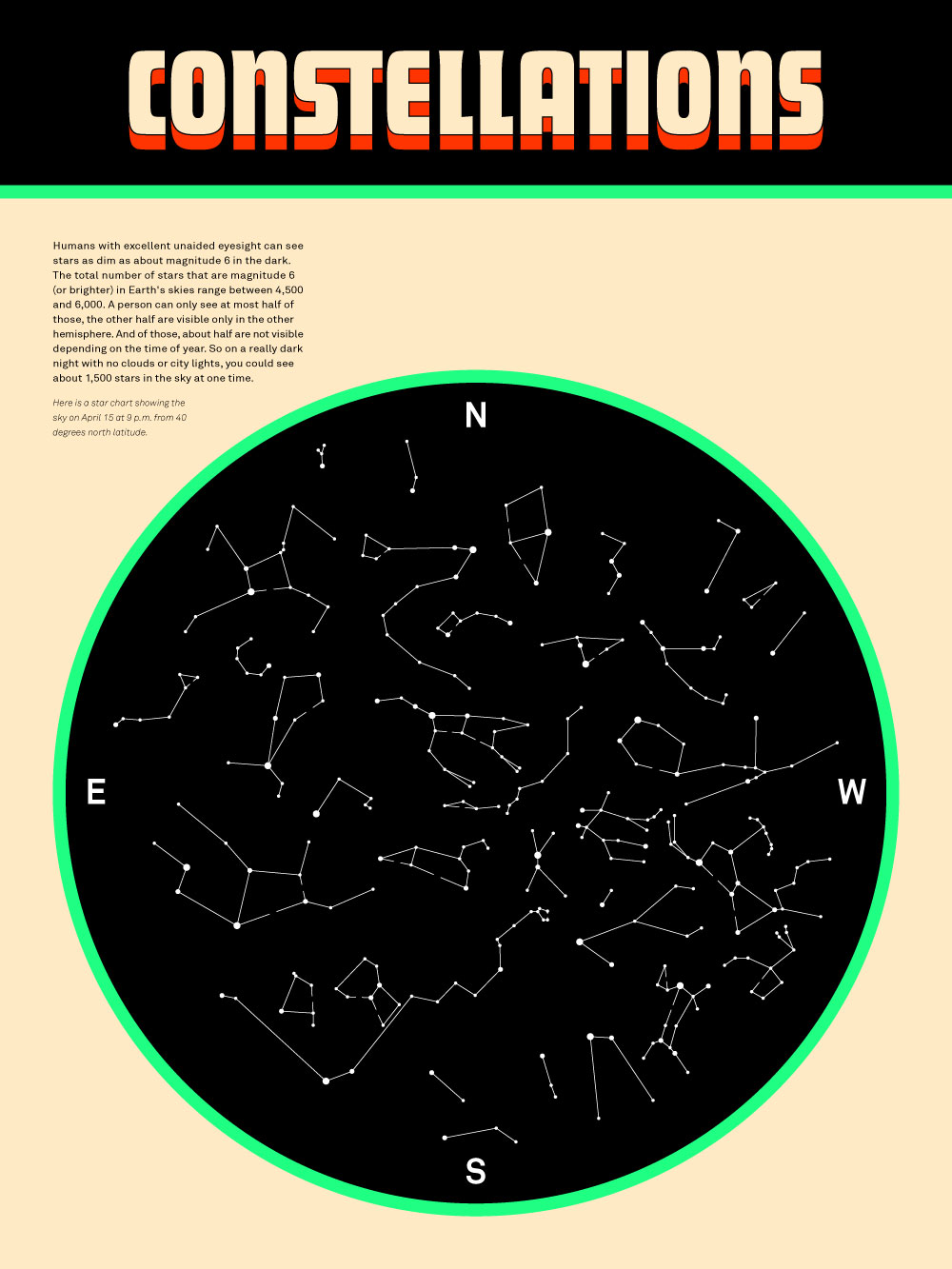
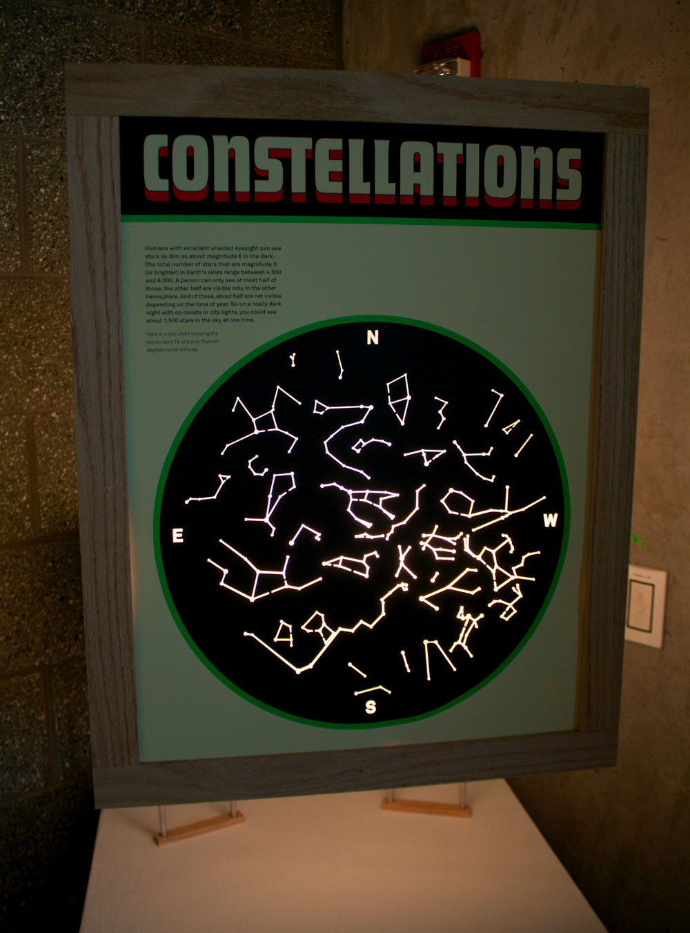
- The constellation poster explains how much light the unaided eye can see from distant stars in the night sky.
- The interactive website provides supporting scientific infographics and further information.

The visual aesthetic of both the product and graphic design are inspired by the streamline simplicity of German industrial design, such as work done by Dieter Rams, and the more colorful geometric mid-century modern design, such as work done by Olivetti Typewriter Company.
I would like the participant to be reminded of the presence of light that we encounter every day, and night. The beauty of light should not be overlooked, because if you haven’t noticed, it is all we ever see.